Graphic & Interaction:
The two items I picked were some vinyls I bought for 1 euro in my room. I started the process by scanning them:


Secondly, I noted down how the designers show hierarchy through size and colour.
Then I analysed how the eyes bounced around the page and how they were affected by both size and colour.
Lastly I examined the typography and how it also affects the way the design is perceived.
After analysing this I wanted to mix up the hirearchy to try and change the way the design was perceived. To do that I started dissecting them into individual elements in Photoshop.


In both of them I explored what would happen when taking away the main colour of an element, playing with removing it or keeping it and nothing else. Exploring with trying to communicate said elements using the least amount of information possible.
Here are some of the first results:


I took all the images from the first examples of vinyl records, using only their main colour and nothing else to try and create and interesting composition but I couldn’t stop seeing a merge of comic book covers and I did not like it.
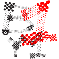
For the second one the designer used what is called a proscenium layout and I wanted to keep it but in a more subjective way. Since I wanted to steer away from the hero image and everything surrounded it I decided to use the image as the proscenium arch.
Here are the final results:
Libero:
Here are some examples of some subjective mapping I found particularly interesting, mostly because of their unique and personal nature.

Mira Rojanasakul’s exploration “Subjective Cartography” features maps that challenge the nature of cartography when representing only factual information. By borrowing the vocabulary of mathematics, typography and science she answers the question “what do the lines and dots symbolise beyond imagined borders and communities?“. Resulting then in representations of how animals and humans must adapt not only to the geographical limitations but to the borders created by man regardless of how imaginary they are. I find this particularly interesting because of her focus on the process rather than the result and how this reveals unseen details about the space.
Sohei Nishino’s i-Land is part of his Fantasy series of maps that grew out of the Diorama map series where he focuses on representing cities using their own memories (through photographs). What is unique about the Fantasy series is how he explores the balance between fantasy and reality. It is a representation of his fantasies portrayed through real memories and pictures which highlights the contrast between what is real and what is not.
Lastly, Mapping Manhattan by Becky Cooper is a book with a collection of 75 maps created by inhabitants of the island in which the individuals tell a story about their own experiences in the space. What I found interesting is the how each individual might focus on a different topic when creating their own version of the space.
Illustration:


