Theory:
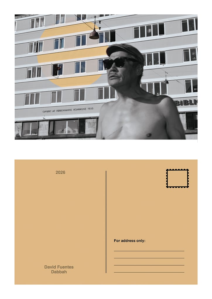
I made two postcards since one was my own work and when writing about it I felt like I was glazing it too much.
Here they are:

Studio-Lab:
When making my first alphabet I looked around my room for objects that looked like letters. When making it I embraced the dissonance between the objects to create the feeling of freedom and liberty.


Secondly I made an alphabet with typefaces around my room from posters, postcards, vinyls, books, cd’s etc. In this case I focused on a more structured or “mechanical” approach.


Then for my dream posters I focused on the concept of infinity, explored through the themes of freedom and ambiguity. I decided to explore freedom because when I dream it is often that my mind creates abstract environments and characters that I can barely explain when I wake up. Sleeping and dreaming feels like a space for my mind to run wild without boundaries.
These ideas are explored in two different layers, the first through everyday objects and dissonance while the second one is more mechanical or structured but still playful.


I also made a third alphabet constructed of photographs only.


Libero:
Here are some clear examples of what I perceive to be Graphic Design, Illustration and Something in between, respectively.

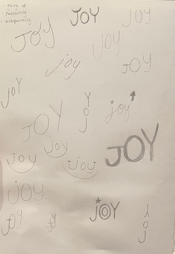
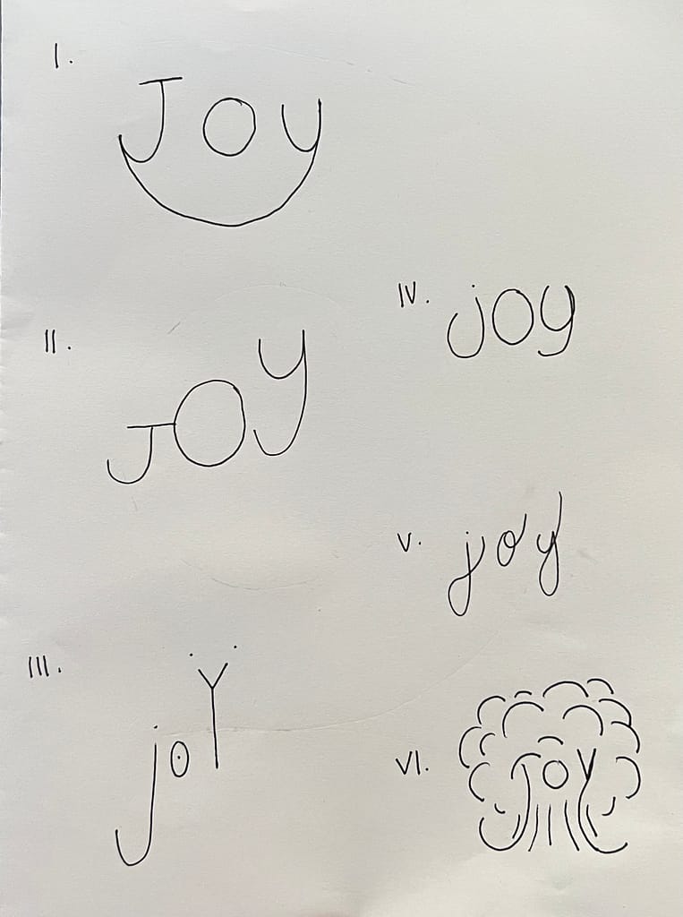
Next is my exploration of showing the feeling of the word “JOY” using the word itself: