LIBERO | assignment 1
Hand drawn illustration using the word Complexity
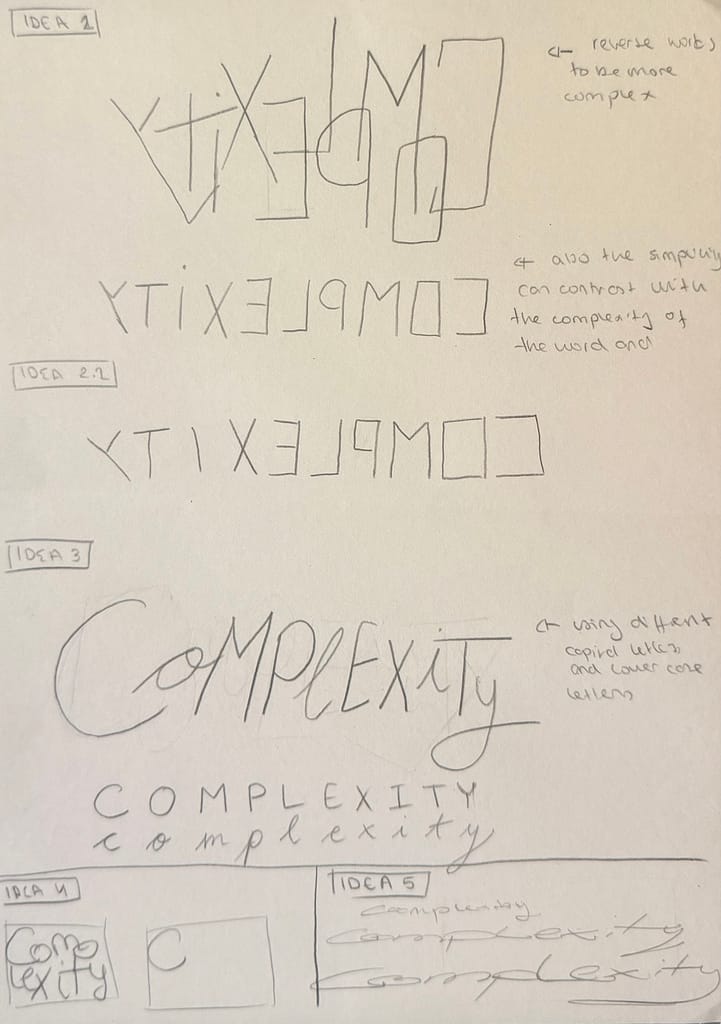
different Ideas.
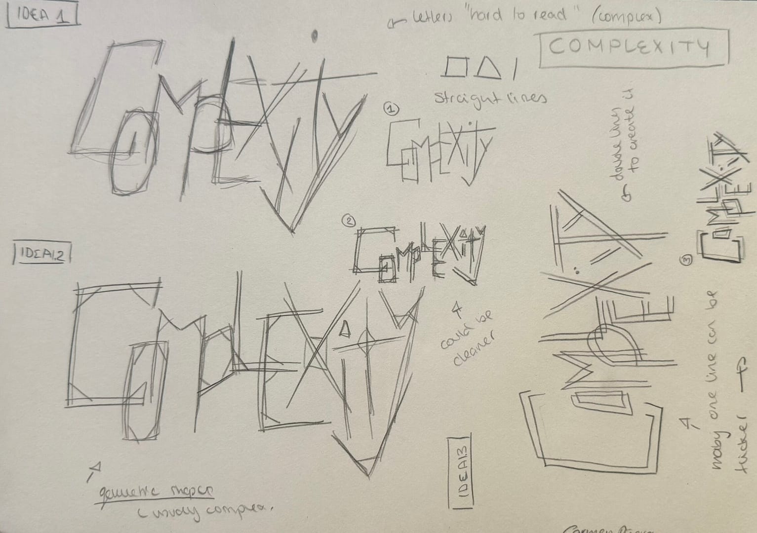
choosing one main idea, but ideas for the font
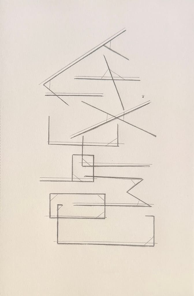
Final Piece for Complexity.
Word is backwards, straight lines, geometric shapes, thicker and thinner lines and overlapping of letters portrait complexity.
LIBERO | assignment 1.2
3 examples:
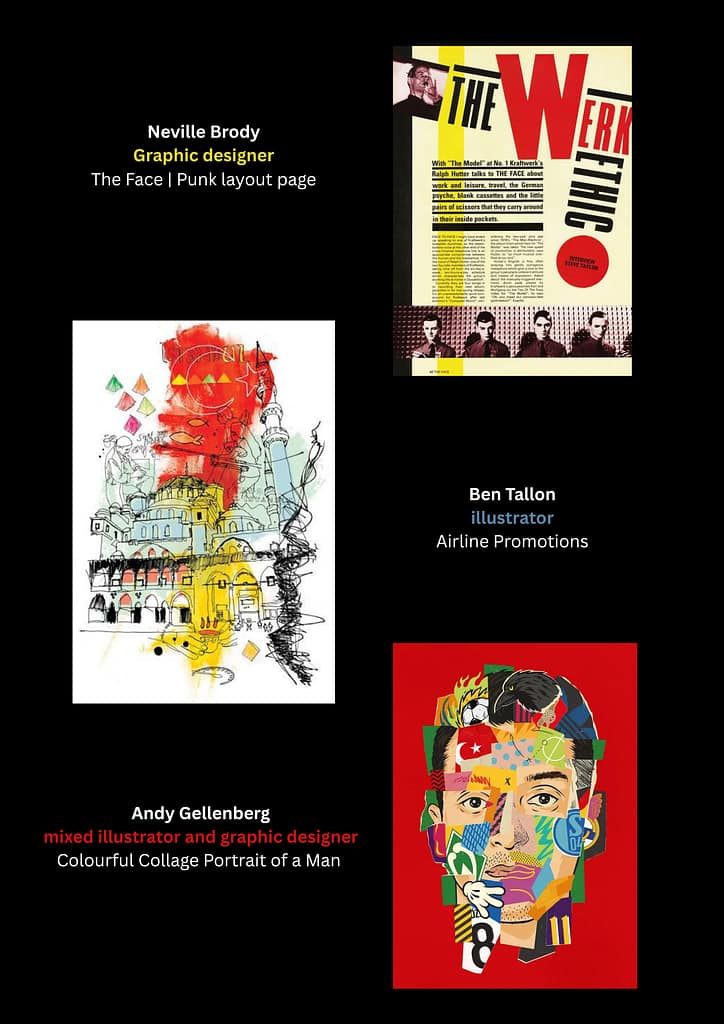
STUDIO-LAB/GID | assignment 1
Alphabets in my room
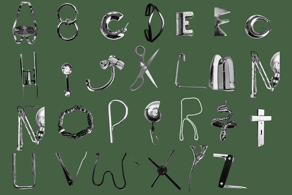
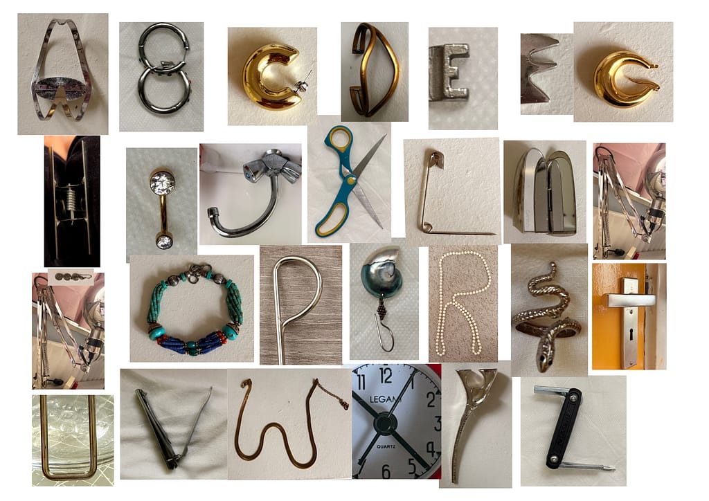
1st Alphabet
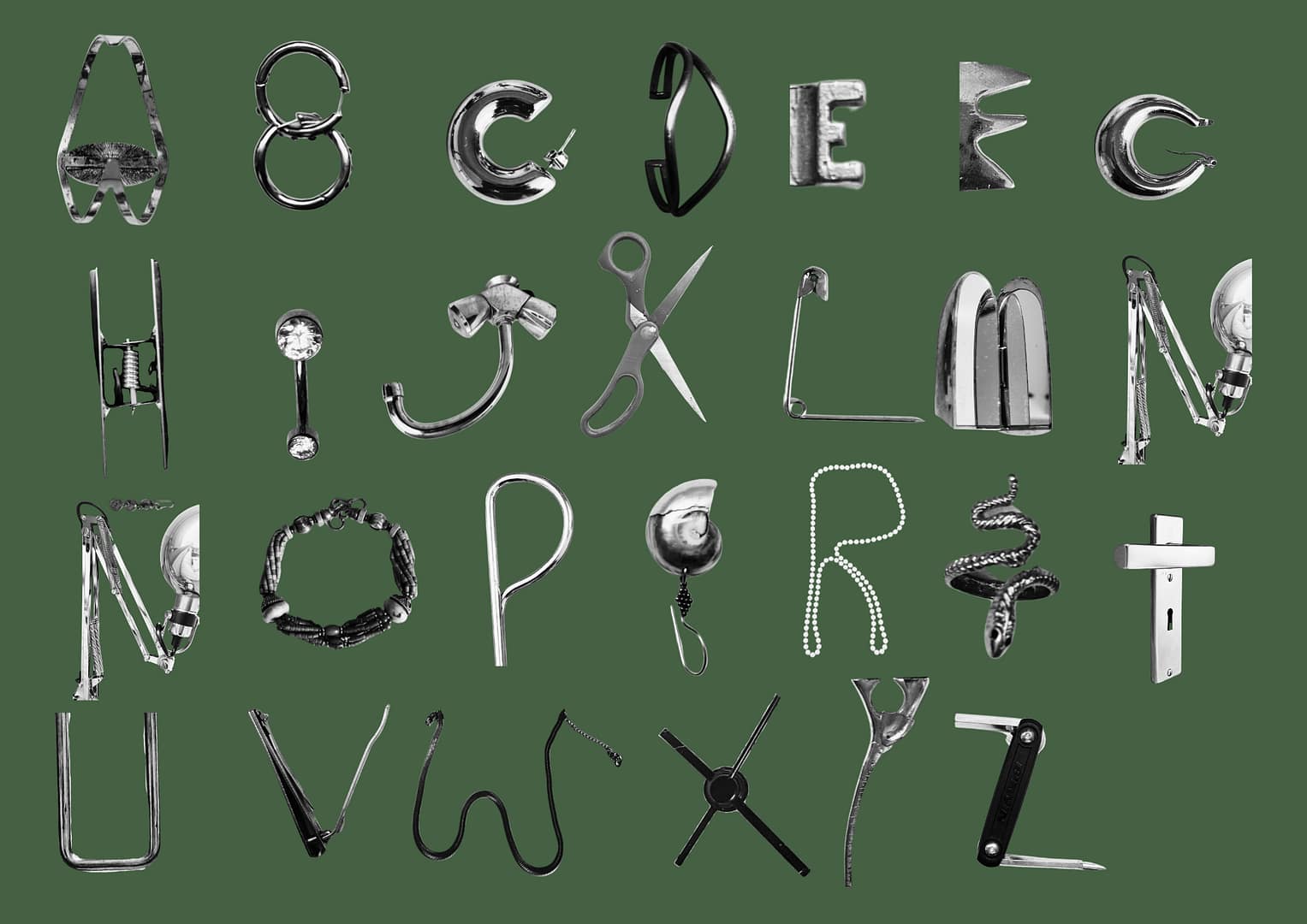
In this alphabet I collected images with objects that were made of metal or mainly contained metal.
My goal with this was creating a complex alphabet with a very rigid, shiny texture and heavy style.
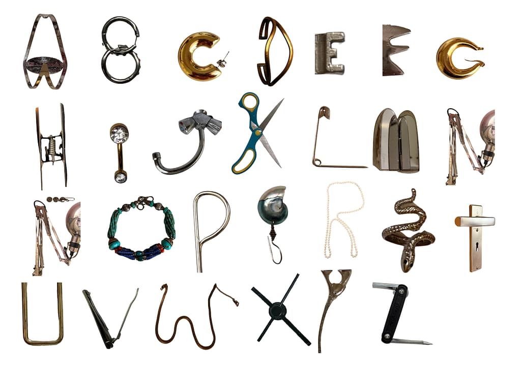
2nd Alphabet
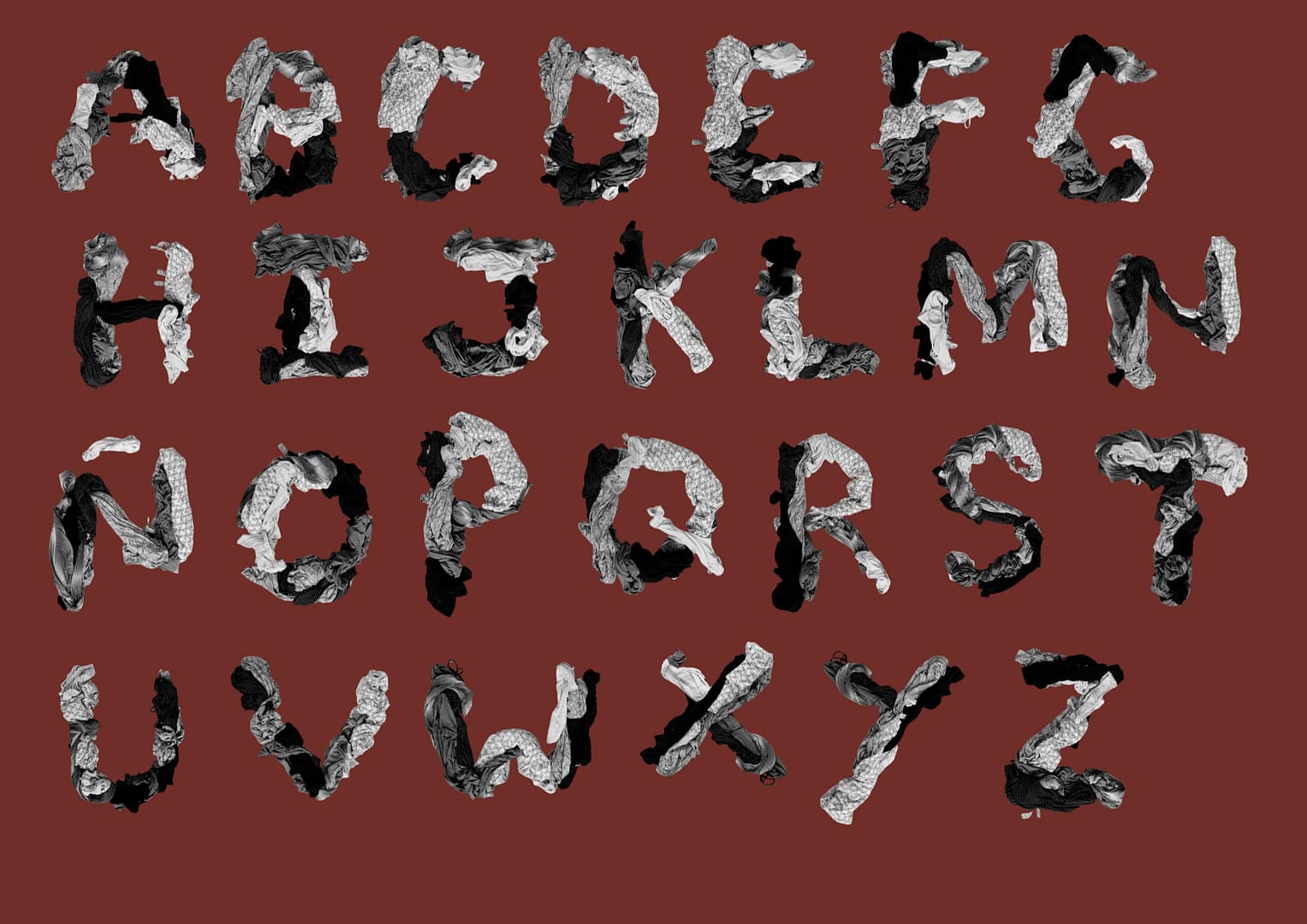
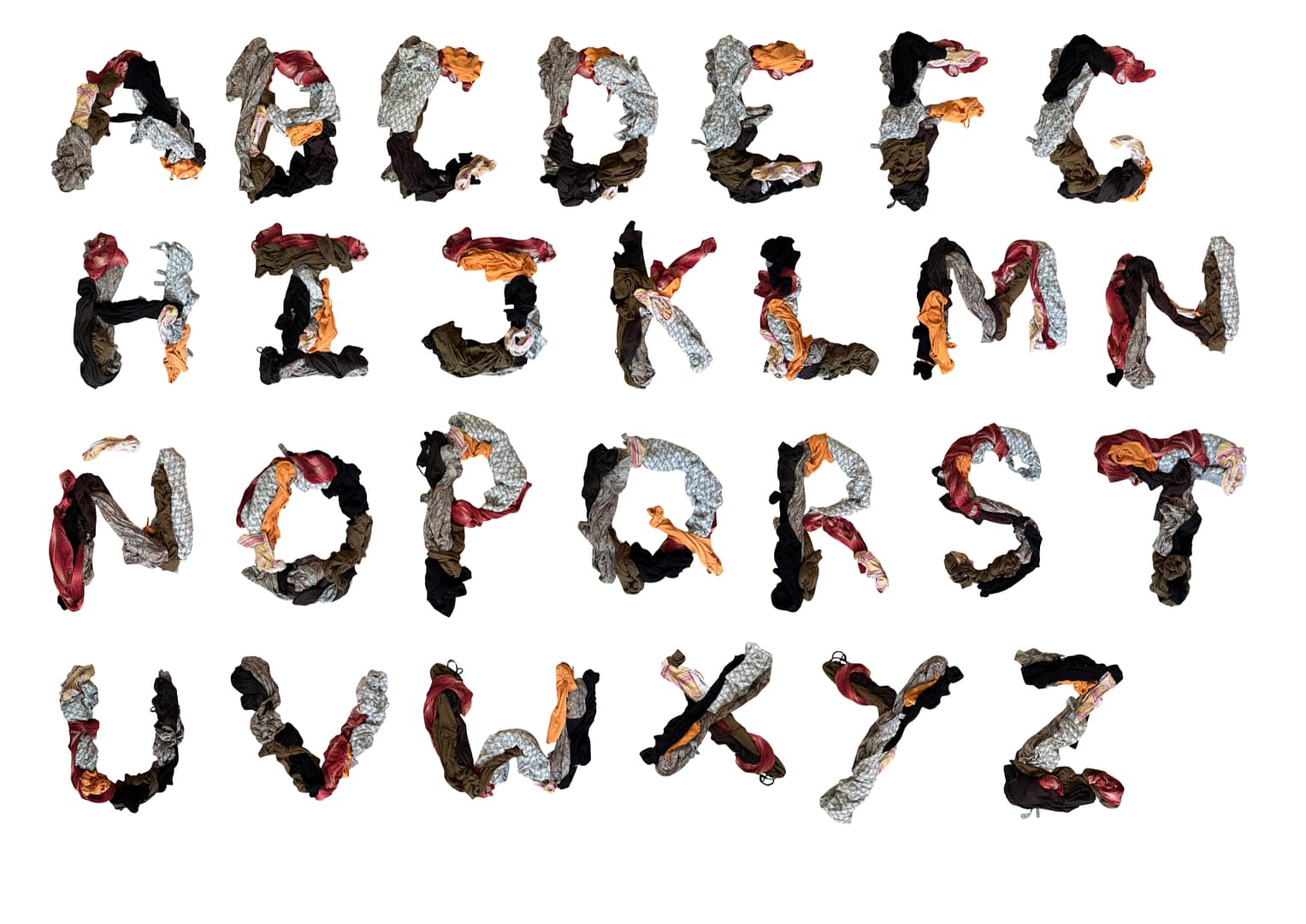
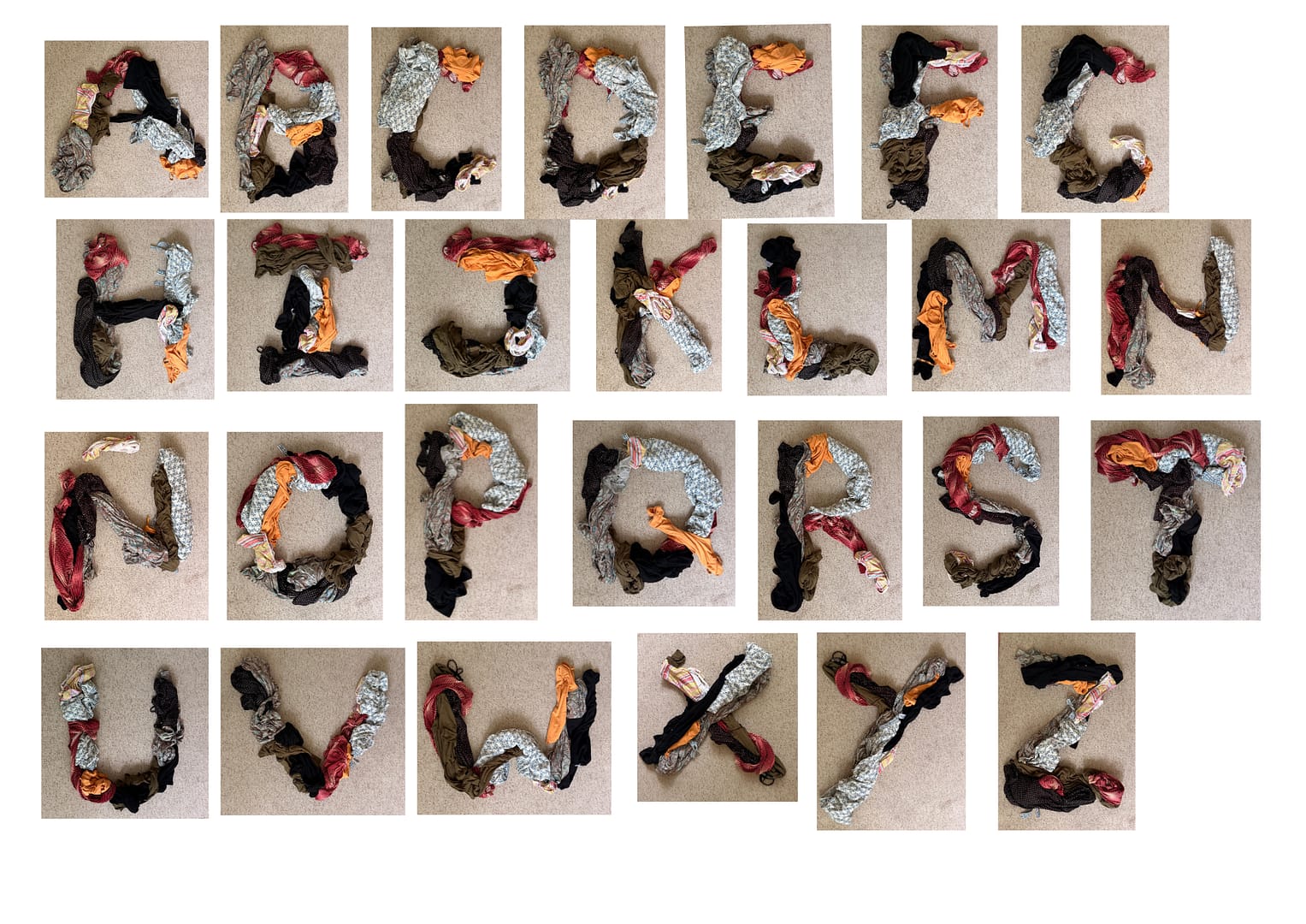
In my second alphabet I gathered my dirty clothes and mixed them into different letters.
My intention was making it soft and messy at the same time achieving a repetitive design.
CONTRAST
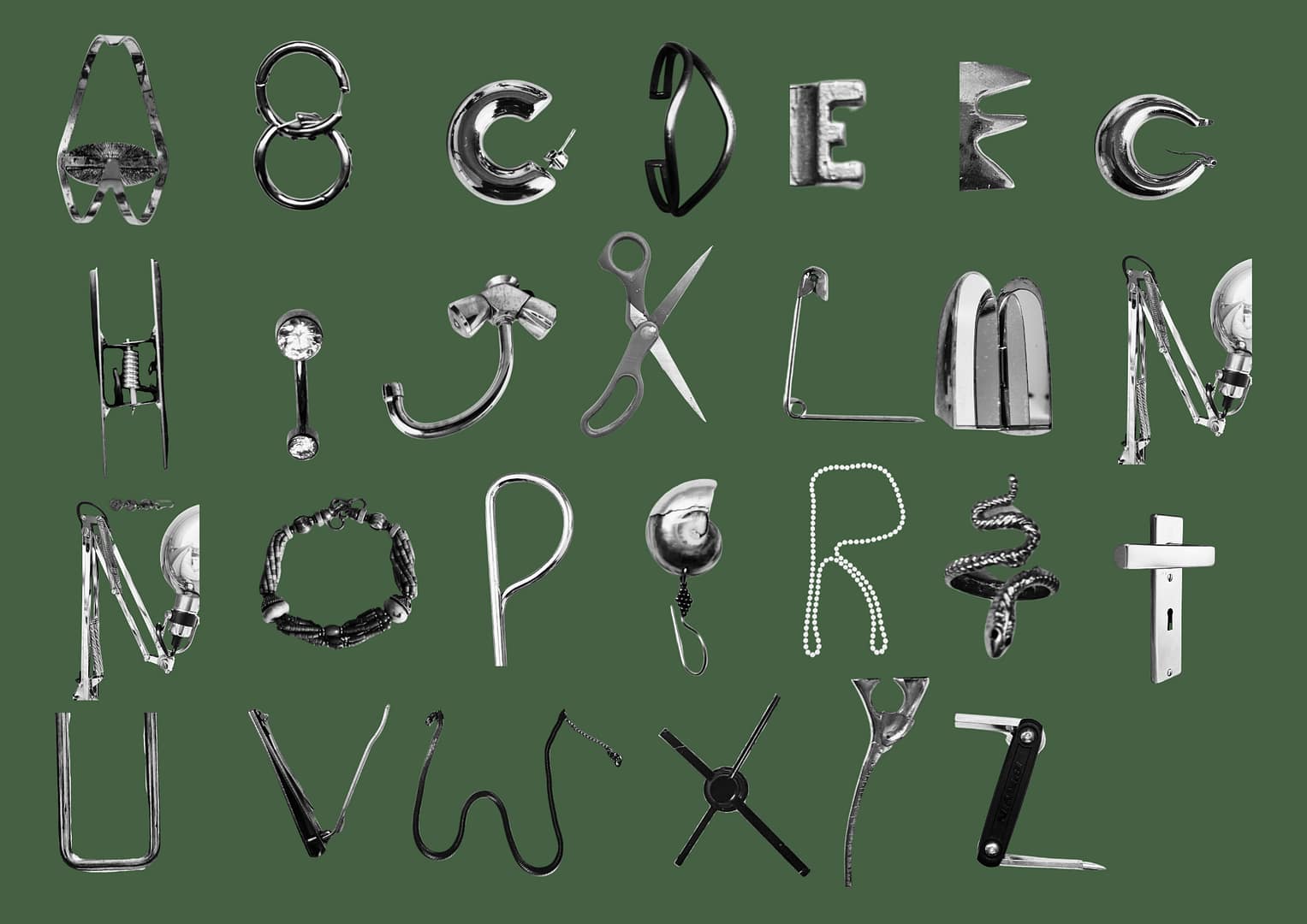
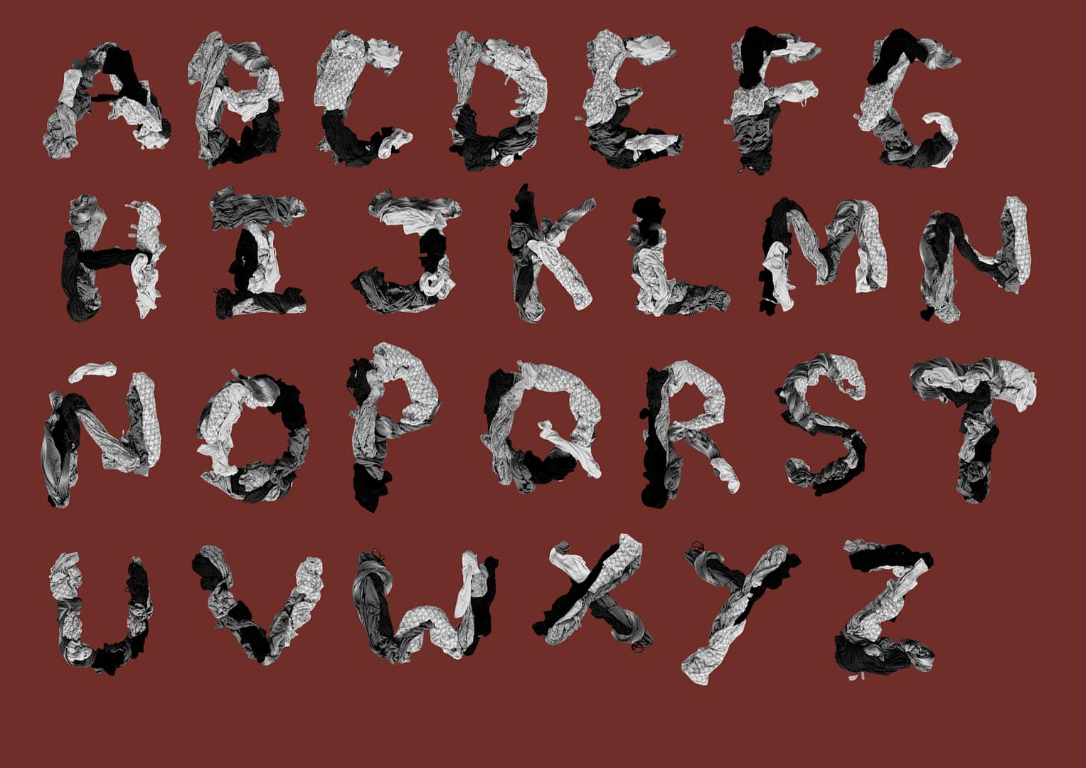
I created these 2 alphabets to mainly focus on the textures contrast, rigid and soft. The metal reflects light creating sharp shadows and the clothes diffuse the light. They also contrast in warmth, metal naturally feels cold at first touch, and clothes keep you warm.
STUDIO-LAB/GID | assignment 1.2
“Dream” in my language
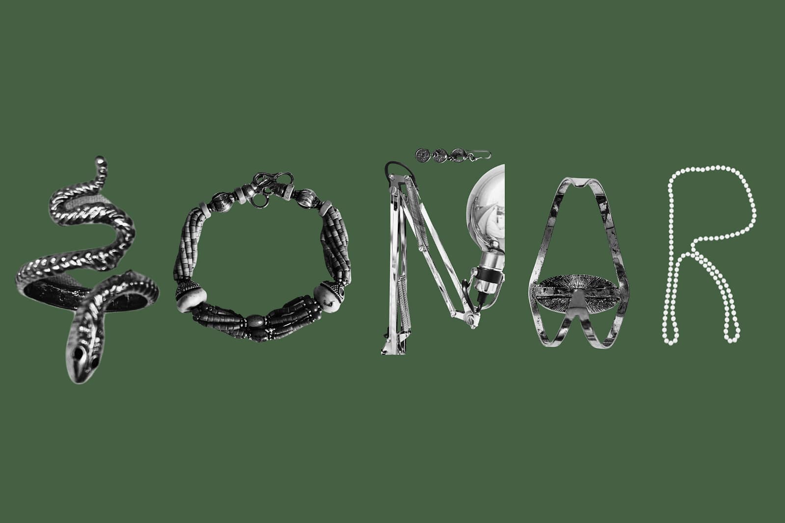
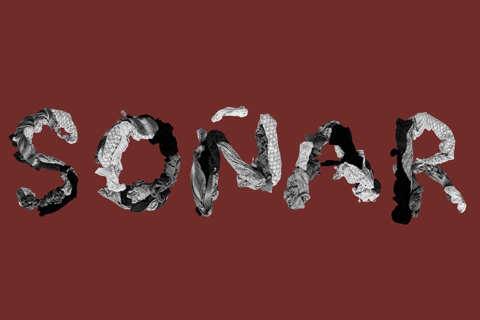
I used these colours to also create contrast. They are not complimentary but for me, Red, is very sharp and strong and Green, is soft and natural. And putting them in the opposite sides make it have more contrast with eachother.
THEORY GI | assignment 1
Postcard
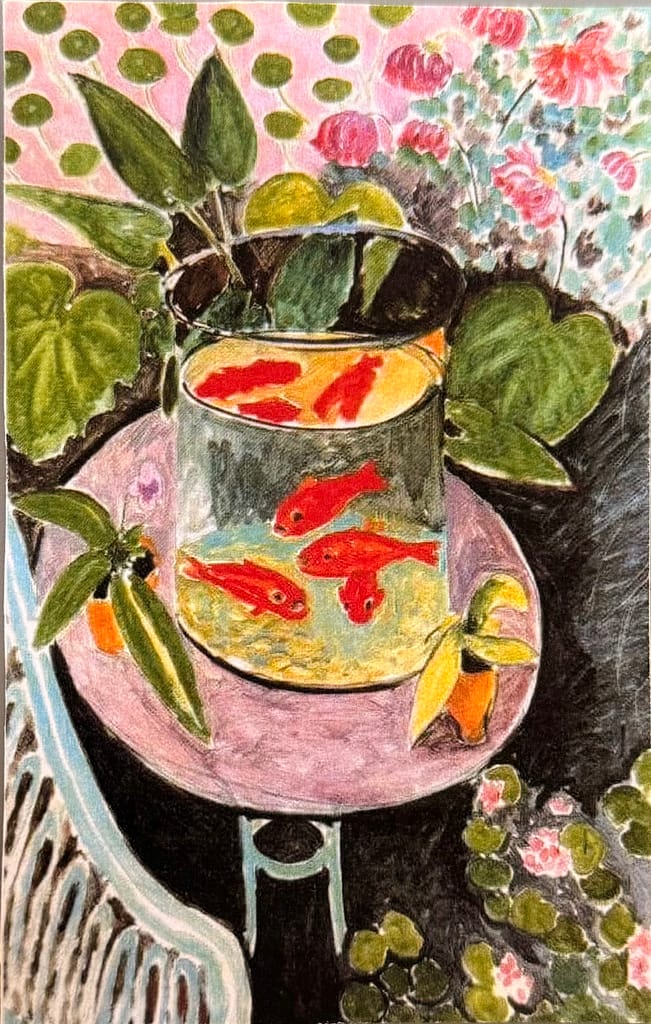
Front of the Postcard :
Art Piece: Goldfish – Henri Matisse
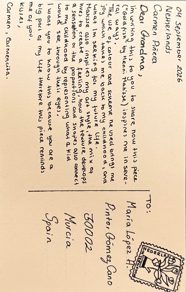
Back of the Postcard :