MAP/ LIBERO


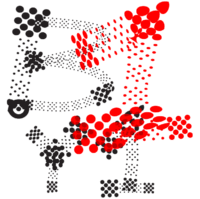
The first map is more abstract. Its not as exact in a way that you can see where to go or to navigate. The second map is very exact, it shows the exact roads and buildings.
The first map is inspiring to me since it combines a real map, but its more coceptual and more free.
STUDIO/LAB
These are the objects i chose. The first is a bookcover from a designbook from Tashen. The second is a graphic design poster that was in a frame for a couple years now.
RESULT
This is the result. I put elements of the designbook in the empty spaces of the shapes of the poster. I put most of it in black and white, i kept the blue as the accentcolour.
