LIBERO ASSIGNMENTS
Assignment 1 / joy
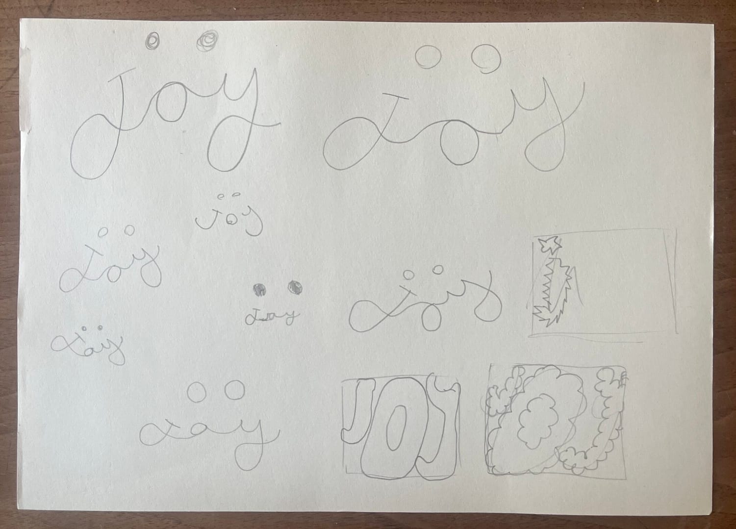
My first idea was to take inspiration from those cheesy quote boards, the ones with ‘live laugh love’ on them in a cursive font. I then started playing around with trying to make it look like a smile by drawing it in a curve. I quickly realised that, at least for me, it looked too formal to really portray the word ‘joy’. I then started over, and started to work with a bouncy like font, I thought that was a bit too boring, though.
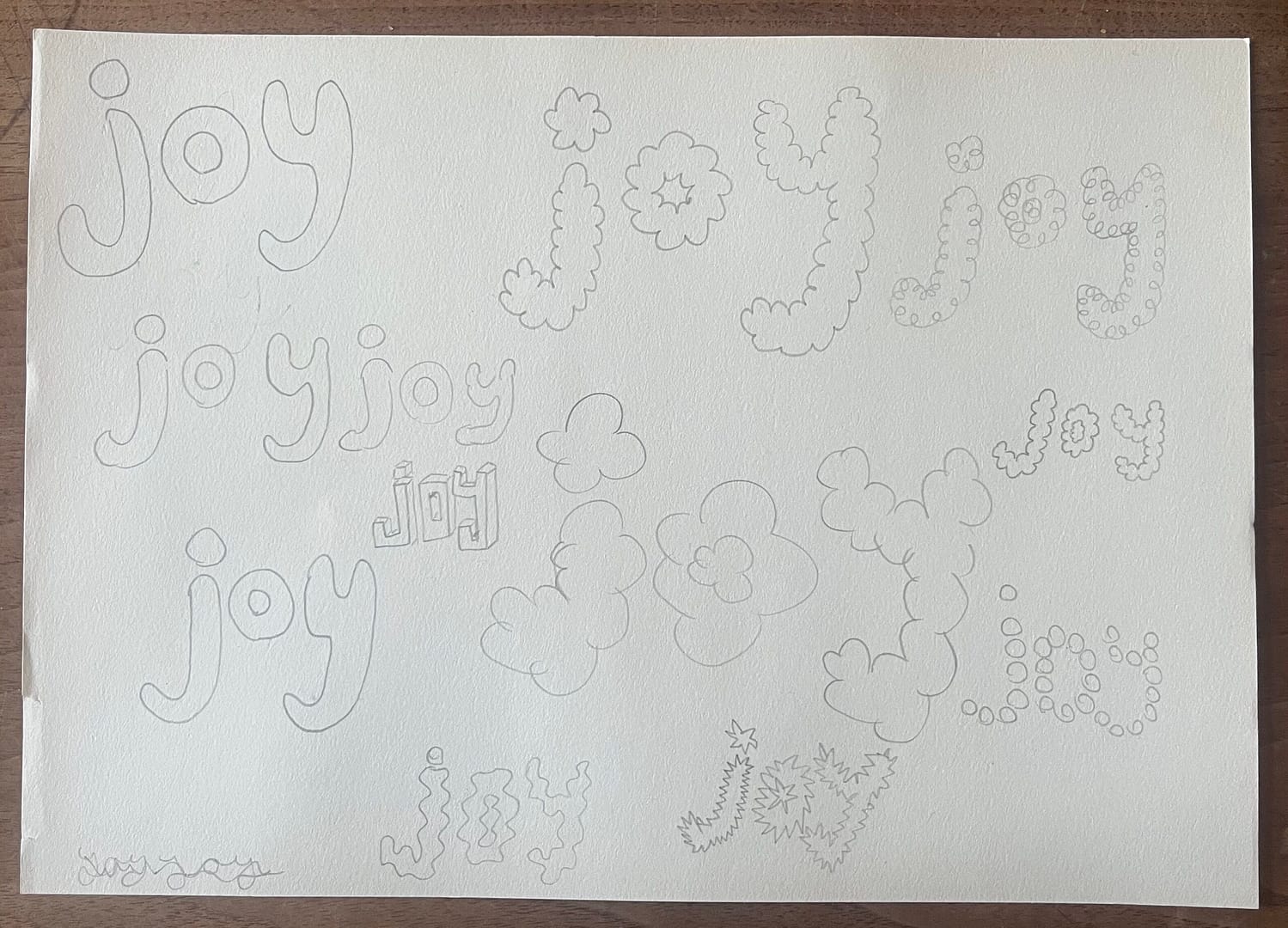
So I wrecked my brain and then thought of my final product! I also played around with the idea of Lego’s, but I thought that wouldn’t work if you didn’t know what Lego’s were..so I went for a cloudy like font instead!
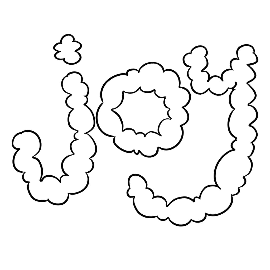
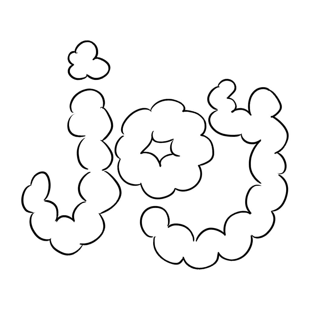
I originally made the curves a bit too small and too close to each other..which sort of made them look like intestines. Which was obviously not the vibe I was going for, so I corrected it by making the curves bigger and a lot more playful!
End design
Assignment 2 / examples
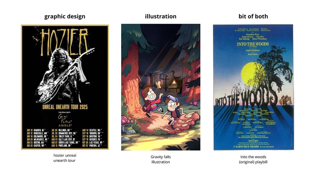
Graphic: A poster for Hoziers unreal unearth 2025 tour. This poster was made to promote the tour and to show the dates and cities he went to.
Illustration: this is an illustration by (I think) the gravity falls team, gravity falls was made by Alex Hirsch. This illustration was originally made to promote the show.
Both: This is a mixture of both illustration and graphic, but I do not know which of the two it specifically belongs in. This is a poster for the original into the woods musical on broadway. It is an illustration in my opinion, but it was also made to convey information.
GRAPHIC DESIGN STUDIO LAB ASSIGNMENTS
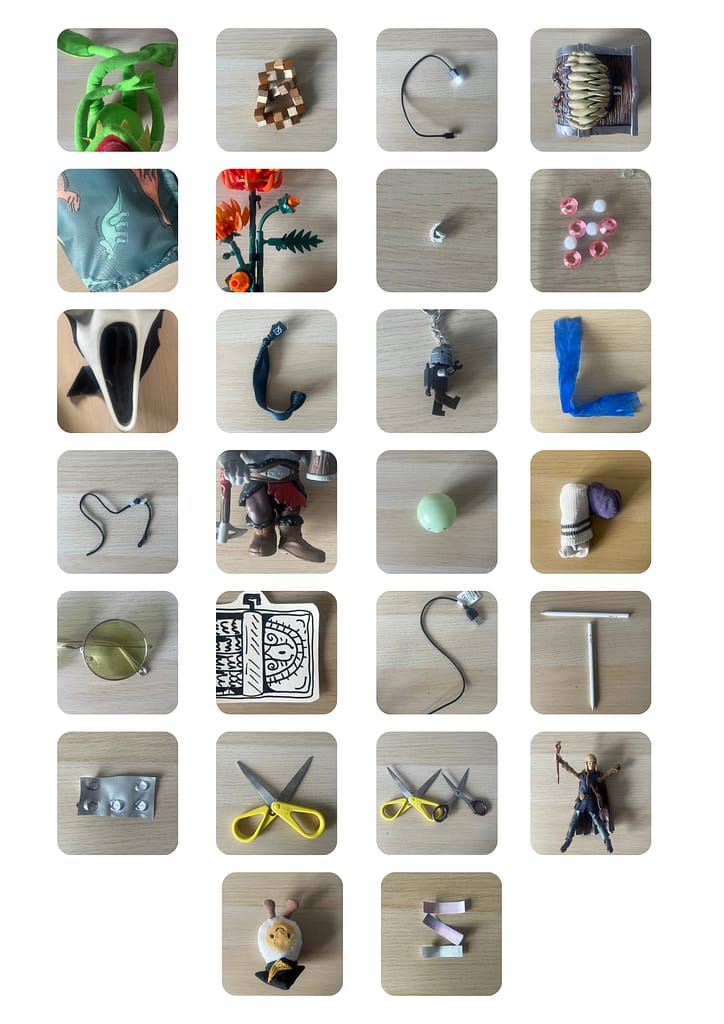
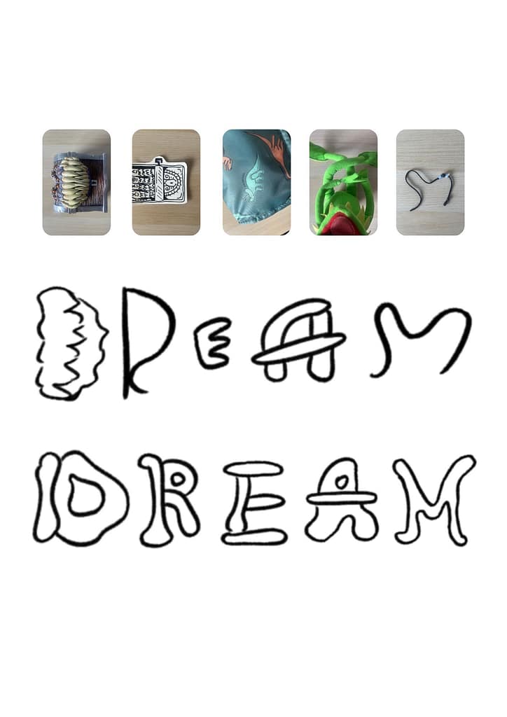
The first Alphabet! With some letters I knew exactly what I wanted to do, and with other letters I was completely stuck. My personal favourites are the letters: A (my kermit plushie), Y (my jellycat egg), and F (my lego flowers). I struggled the most with Q, R, and K.
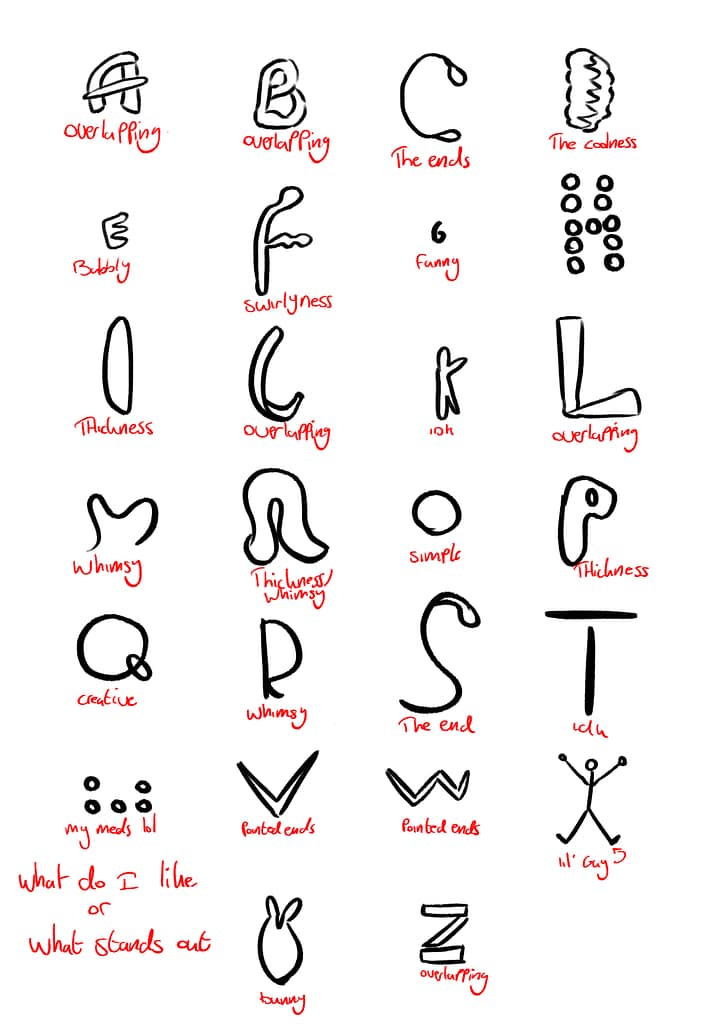
After taking all the pictures and putting them all together, I used it as a reference to make the, what I would like to call ‘the wtf is this Alphabet’! I then used wrote down what I liked about each letter and/or what stood out to me. I noticed that I liked the whimsical and the overlapping letters.
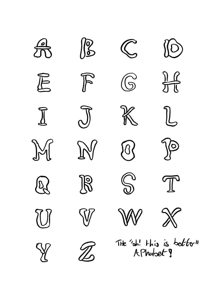
With that information, I made the ‘oh! This is better’ Alphabet! It has a bunch of swirls, unevenness, overlapping parts, but most importantly..a whole lot of whimsy! I like to compare it to a font you would see fairies use :D!
Dream end result
that’s it 🙂
